THE BRIEF
Natural Learning Northwest is a forest school dedicated to immersive outdoor education for children, fostering curiosity, creativity, and connection with nature in the Pacific Northwest region. The school aims to provide a hands-on learning environment where children can explore the natural world, develop practical skills, and cultivate a deep appreciation for their surroundings. The logo should evoke a sense of adventure, curiosity, and the beauty of the natural world. Consider incorporating elements such as trees, wildlife, or natural landscapes to reflect the school's focus on outdoor learning. The design should be versatile enough to work across various applications, from signage and stationery to digital platforms.
THE OUTCOME
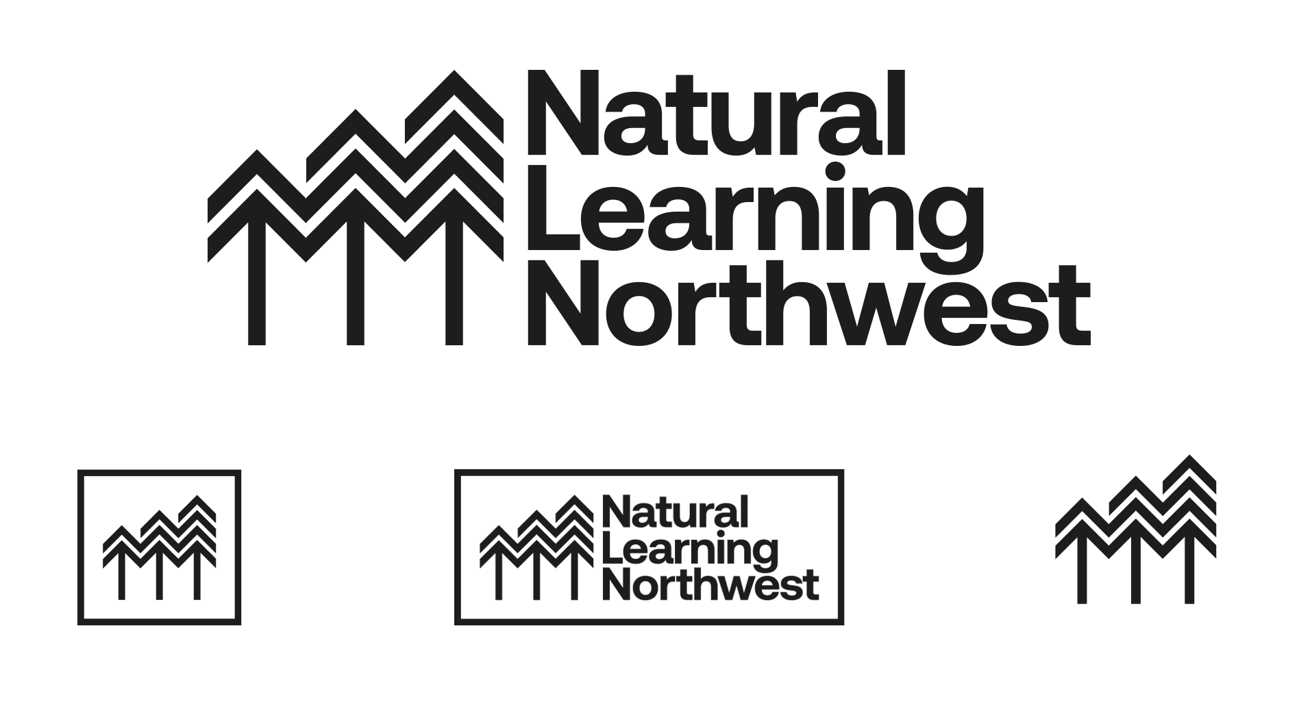
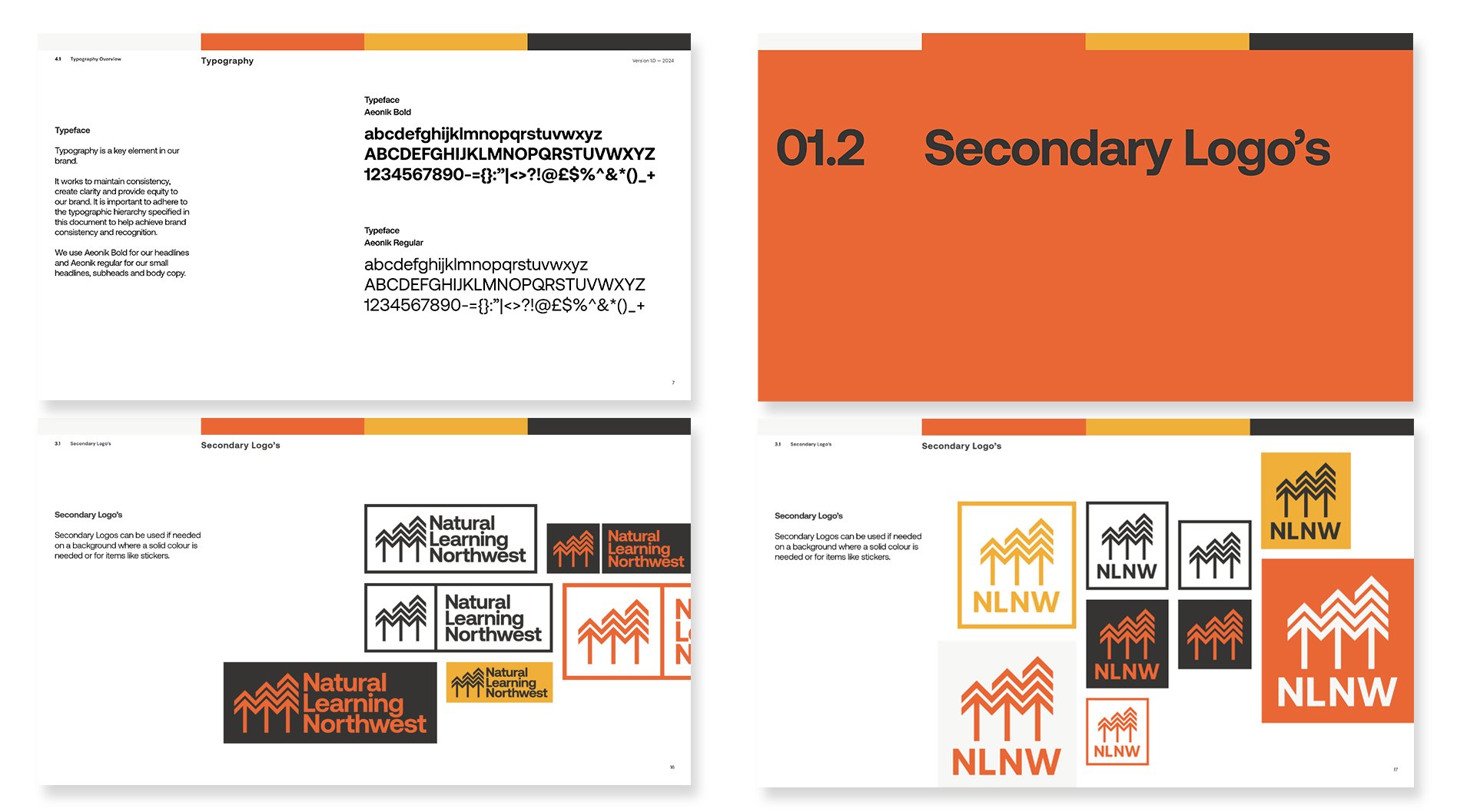
Deliverables: Logo // Sub logo’s // Colour palette // Typography // Course icons.
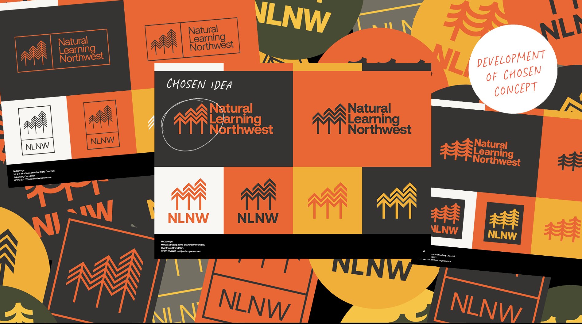
I developed an idea based on growth using bold connected tree icons scaling larger in stature as you learn from being outside in nature. A nod back to the PNW where Natural Learning Northwest are based.
Testimonial
“Since launching Natural Learning Northwest, Anthony has been our go to for every single new graphic.
His expertise and ability to iterate on designs from concept to finished product is absolutely priceless.
Through collaboration, creativity, and an understanding of the final vision for each project, he brings our ideas to life.
I highly recommend working with Mr.O to anyone in need of top-notch design services. He brings genuine enthusiasm and interest to every new project!”
— Colton Running, Program Director, Natural Learning Northwest


Get in touch.
Do you have an idea and want help getting it out into the world. Drop me a line.