THE BRIEF
The launch of a new record label specialising in small batch releases. In the clients words “Music deserving wider attention. A musical adventure of reissued vinyl. In small batches. With love.” The brief was actually very open other than, the logo must work small, in one colour and stand out from the crowd.
THE OUTCOME
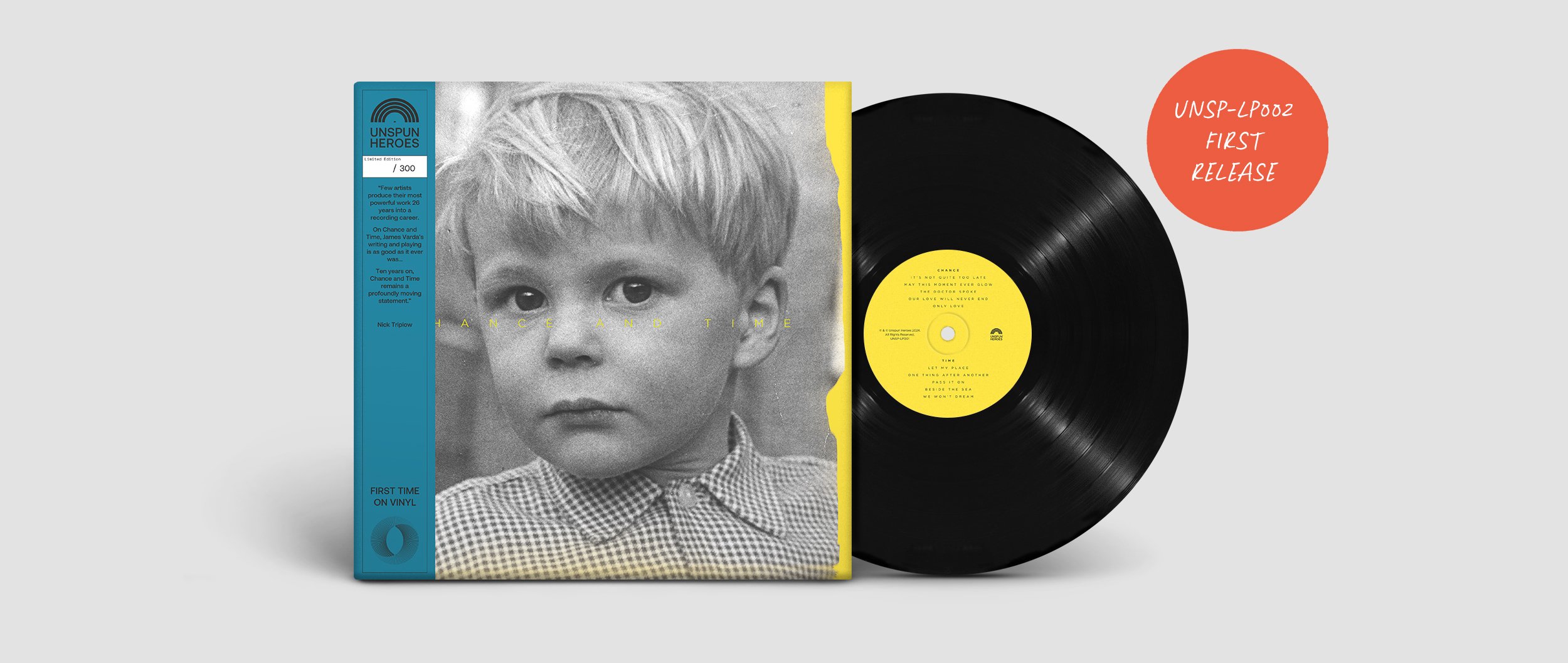
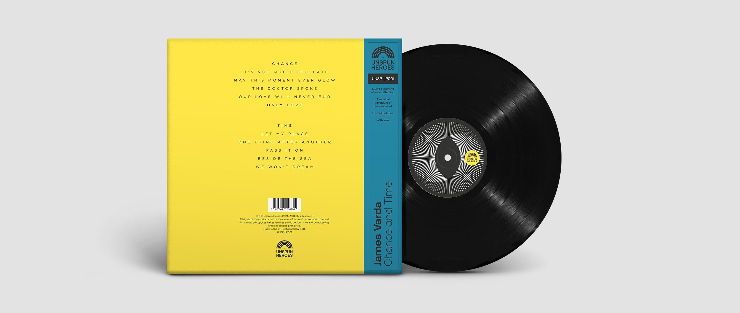
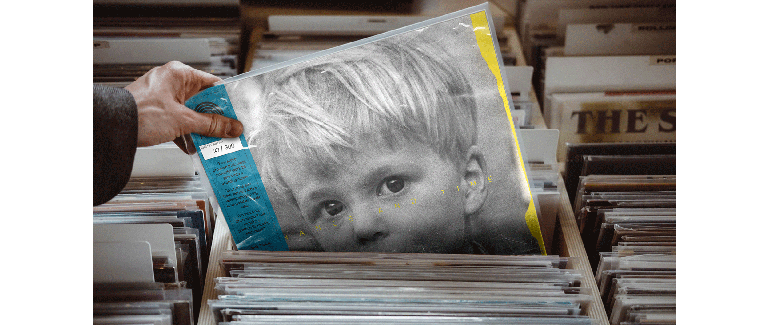
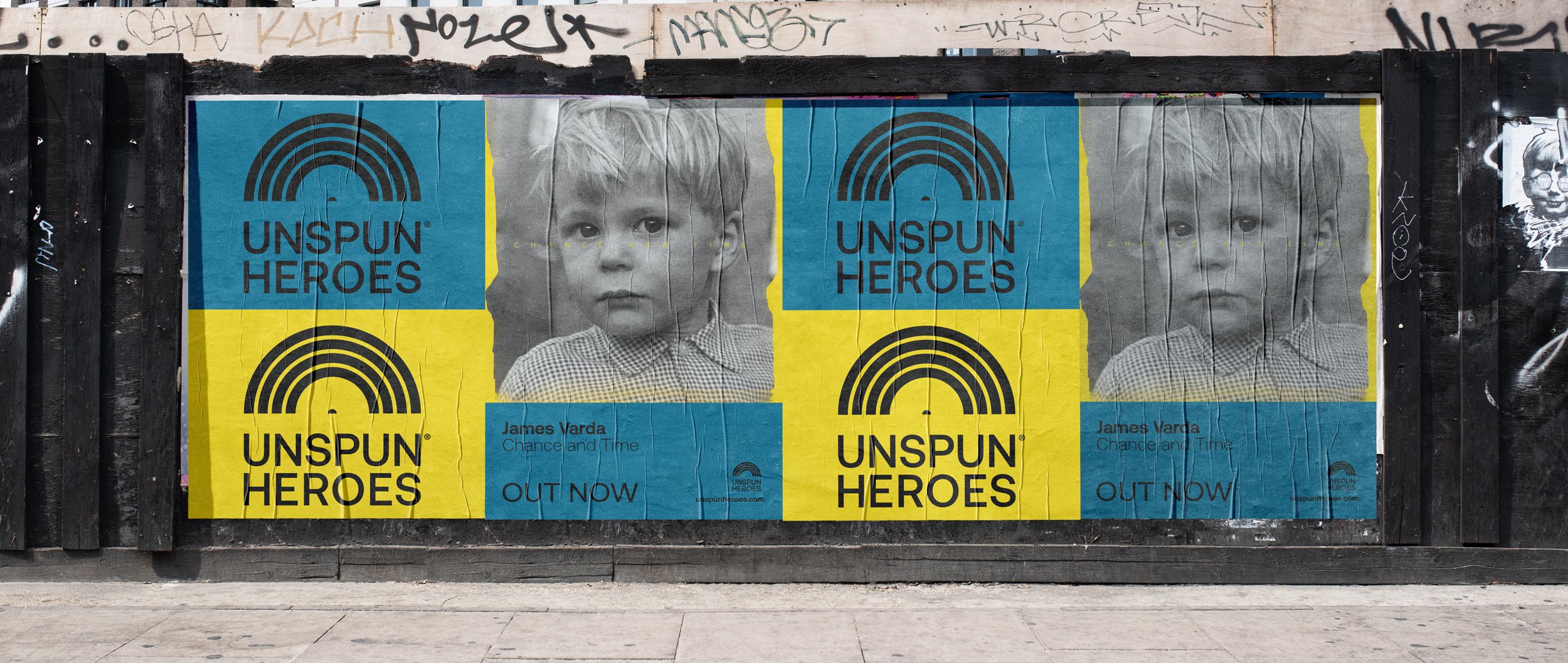
Deliverables: Logo design // First release artwork.
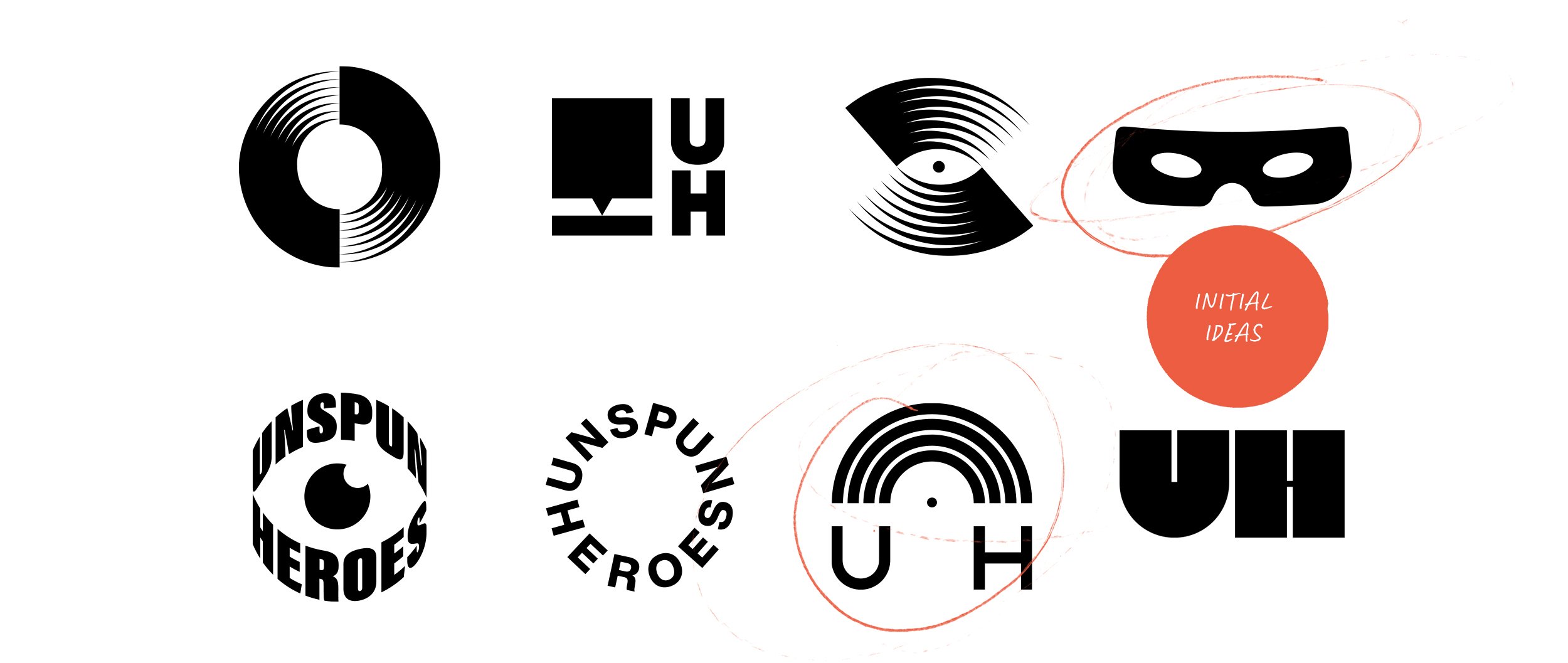
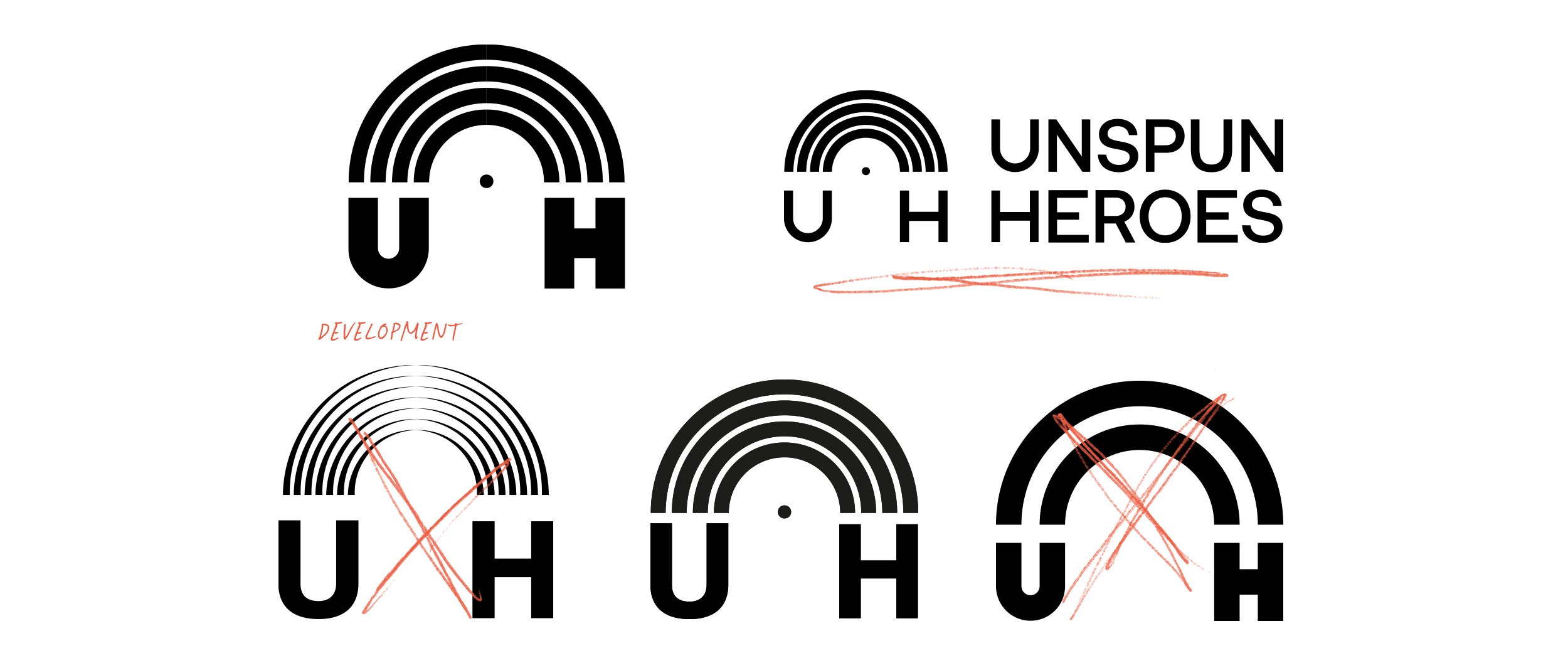
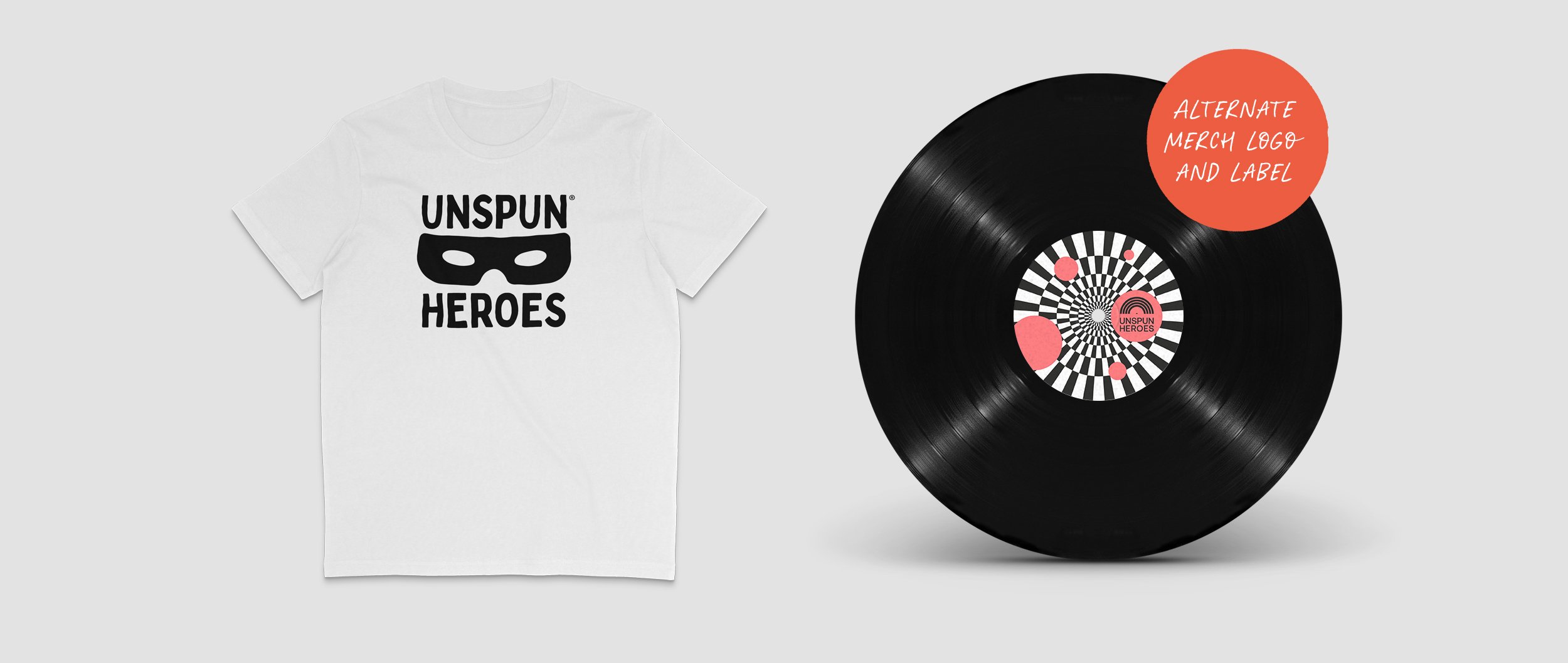
A simple iconic logo that can be used at any size and still be legible. Capturing that moment when you pull a record from its sleeve for the first spin. Simon loved the initial visuals so much he actually ended up getting a separate logo just for merchandise.
Testimonial
“Out of all the decisions I’ve ever made, working with Anthony on the branding for Unspun Heroes is probably in my top three. From the moment I emailed him with the business pitch he was full of enthusiasm and ideas. Things got better from then on. The difficult part was selecting one idea from the many that Anthony created.
I’m so pleased Anthony agreed to work with me - and continues to work with me as Unspun Heroes grows. Not only does he produce killer designs, he’s an all-round lovely chap who brightens my day and makes sure I stand out for all the right reasons.”
— Simon White, Founder Unspun Heroes




Get in touch.
Do you have an idea and want help getting it out into the world. Drop me a line.
